The Challenge
Destination marketing has a sameness problem. Across the industry, ads often look and sound interchangeable—beautiful landscapes, smiling visitors, generic taglines, and familiar language promising that every place is “unique” without actually showing how. In this environment, true differentiation is everything. Cleverness, quirk, and unexpected humor aren’t just creative choices; they become strategic advantages capable of transforming how a destination is remembered.
Winona needed a brand identity that didn’t simply blend into the Midwest travel landscape but broke the mold entirely. The goal was not to imitate what successful destinations were doing—it was to stand so far outside the norm that the work would be impossible to confuse with anyone else’s.
That challenge sent our team on a search for something undeniably, playfully Winona—an angle no one else could claim.


The Strategy
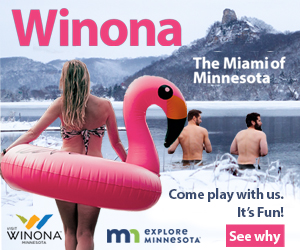
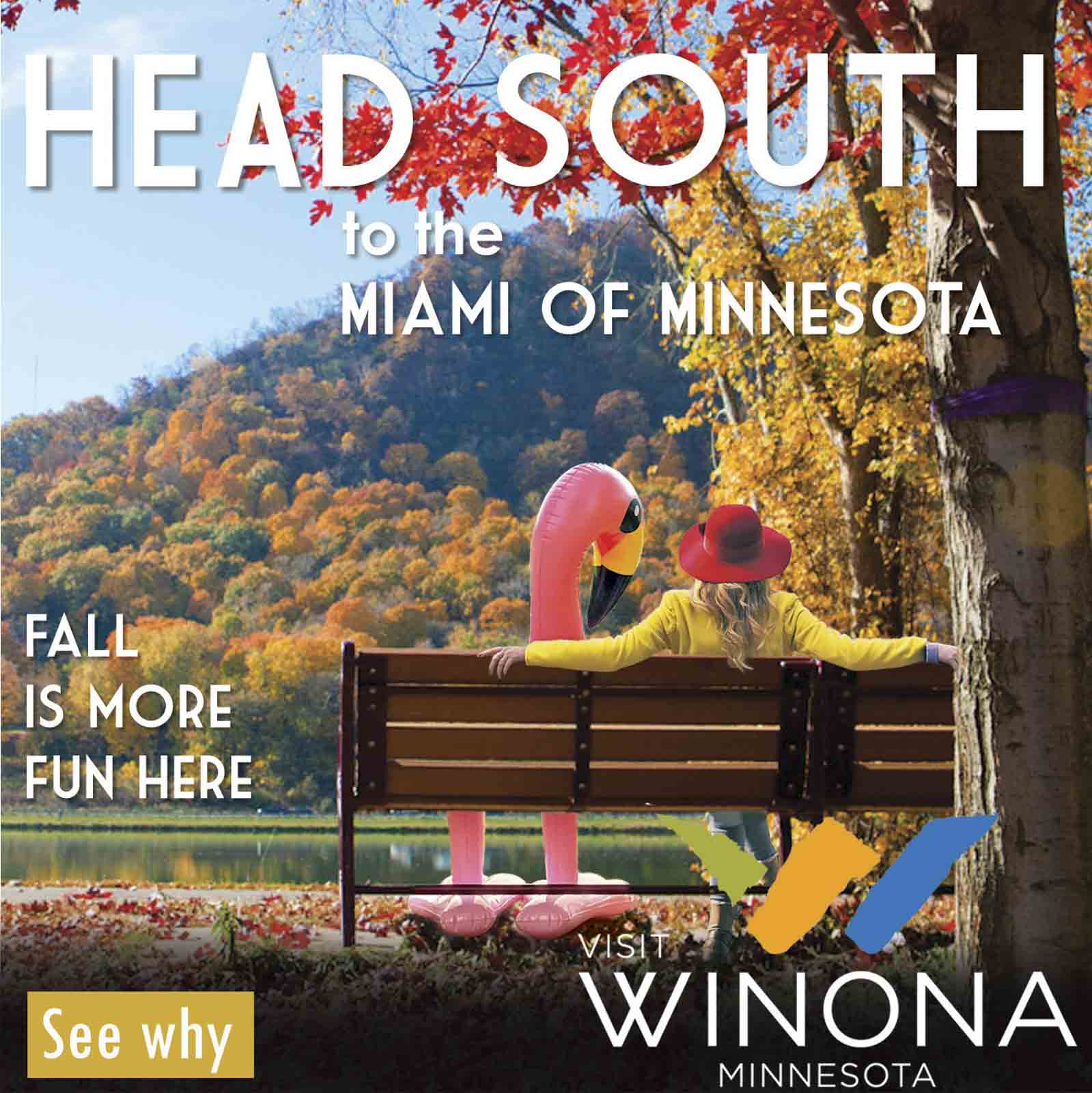
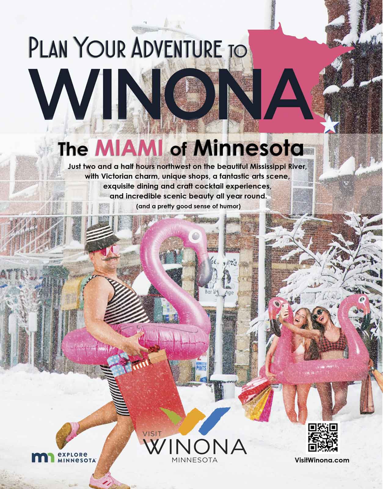
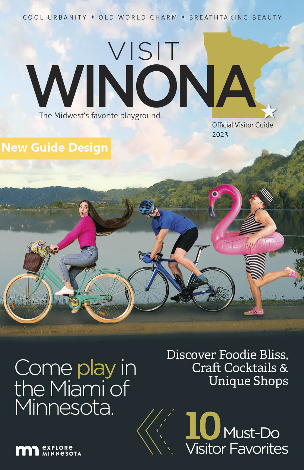
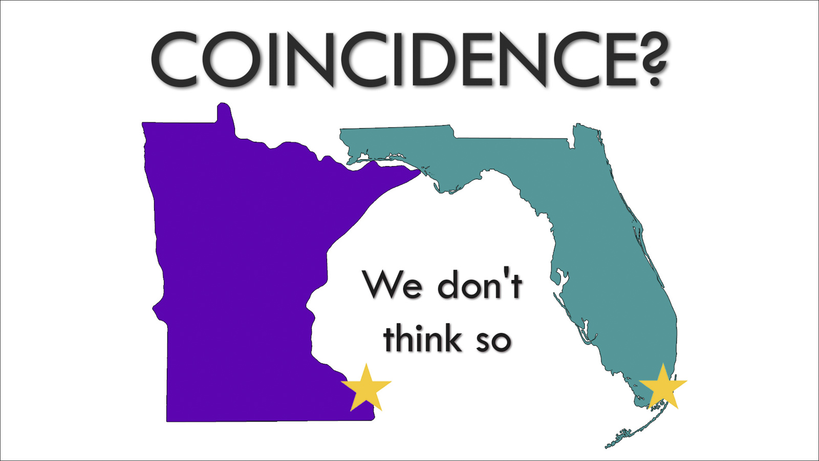
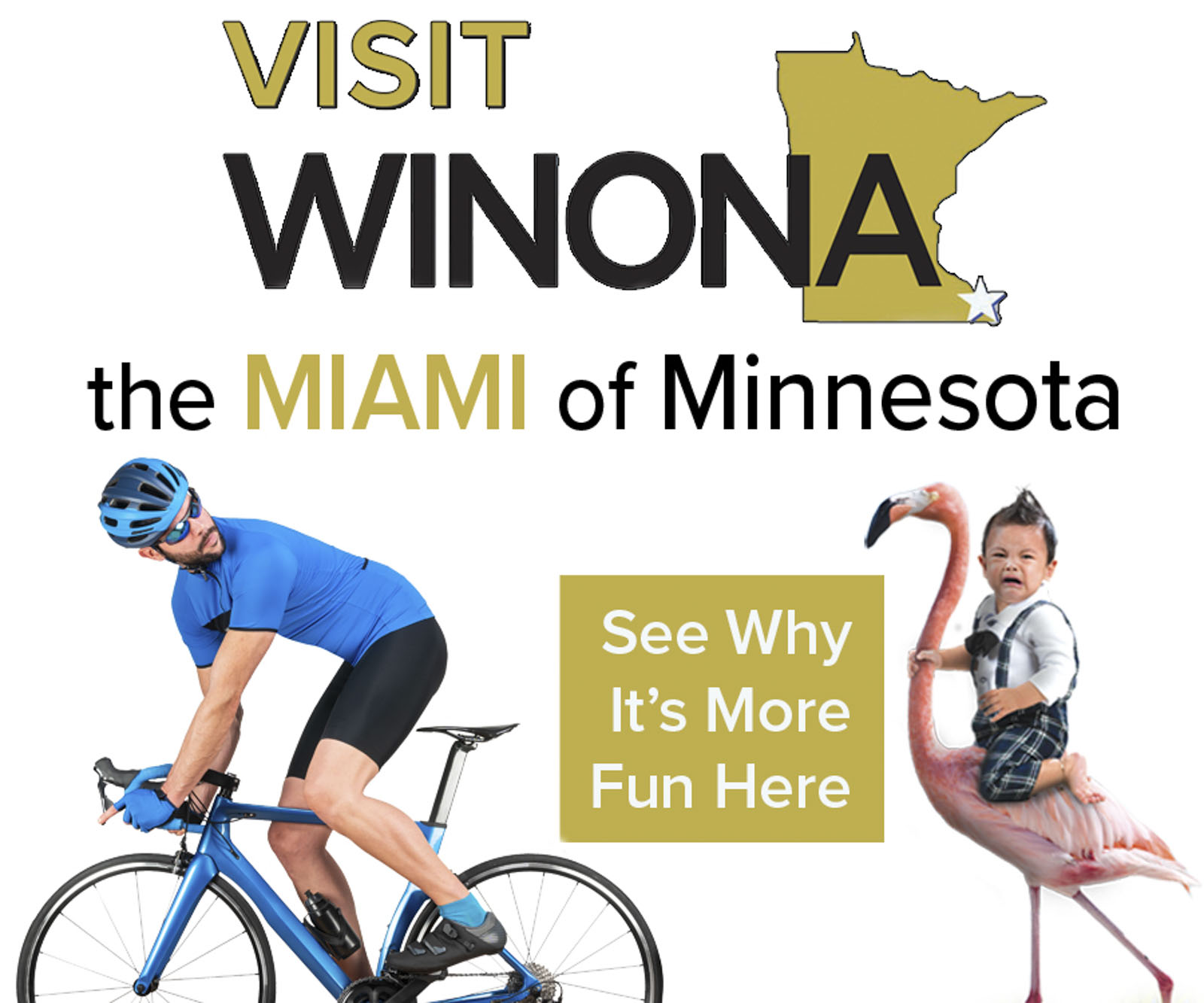
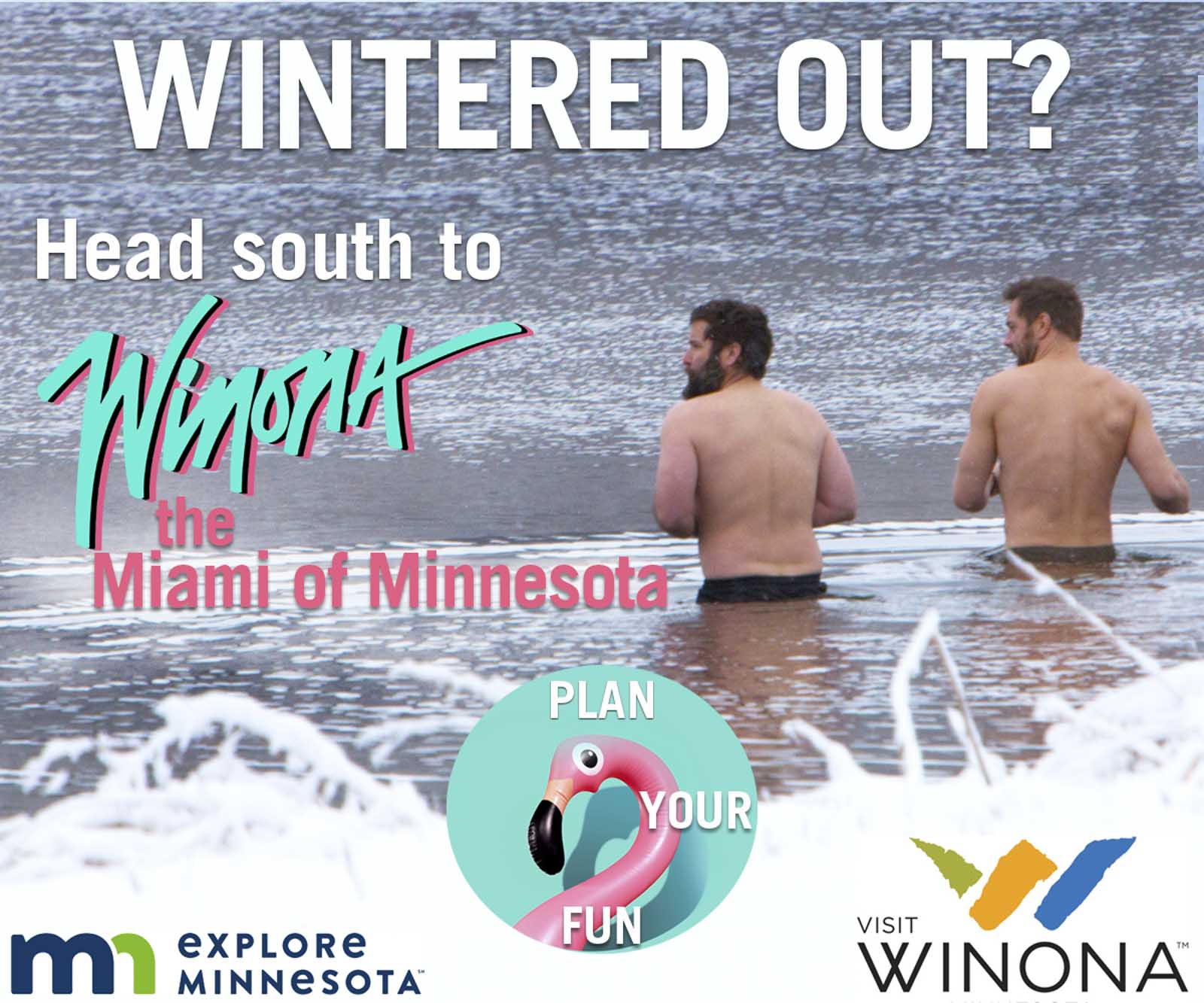
The breakthrough came from an unmissable geographic truth: Winona sits in the far southeastern corner of Minnesota—just like Miami sits in the far southeastern corner of Florida. The connection was absurd. It was funny. And strategically, it was perfect.
We built the brand around that bold juxtaposition:
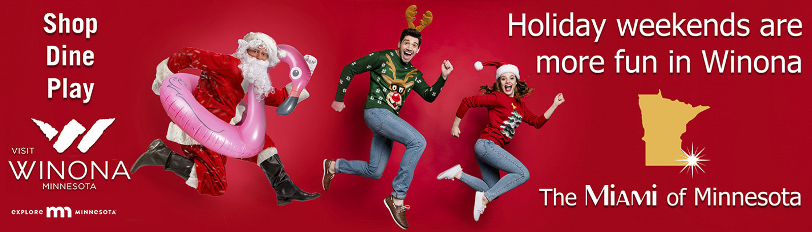
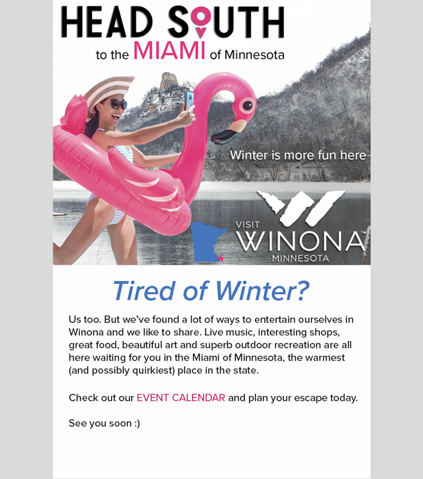
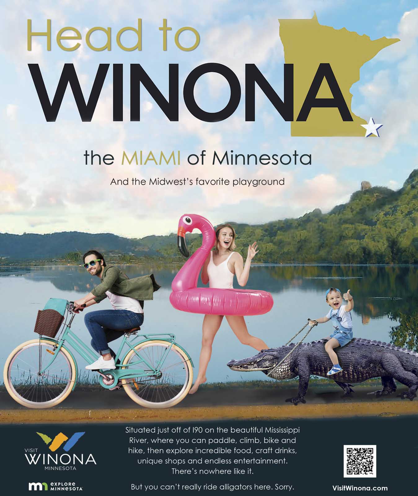
Winona, the Miami of Minnesota.
It began as a winter campaign designed to cut through the gray of the season with humor and color, but quickly evolved into a year-round identity. The strategy centered on three principles:
- Unexpected differentiation: A creative platform capable of stopping people mid-scroll, surprising them before the message even landed.
- Playful exaggeration grounded in truth: Using a geographic parallel as a humorous anchor while celebrating Winona’s real cultural richness.
- Visual and tonal disruption: Vibrant imagery, cheeky storytelling, and confident copy that stood in stark contrast to traditional Midwest tourism advertising.
The Miami of Minnesota concept became an instantly recognizable calling card—something audiences wanted to engage with, share, and remember.
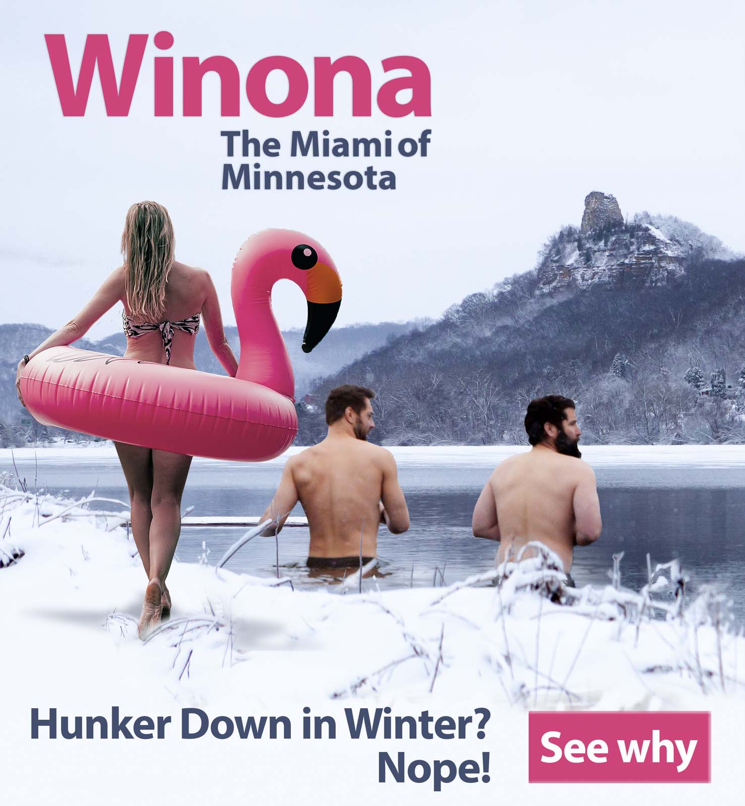
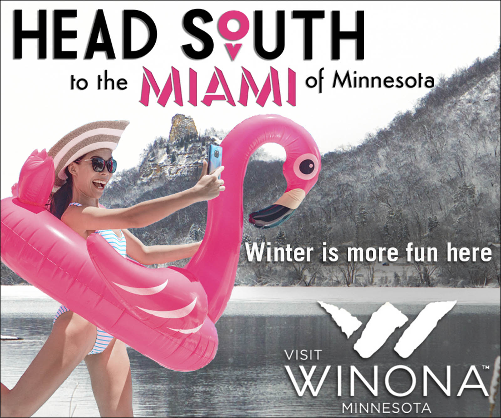
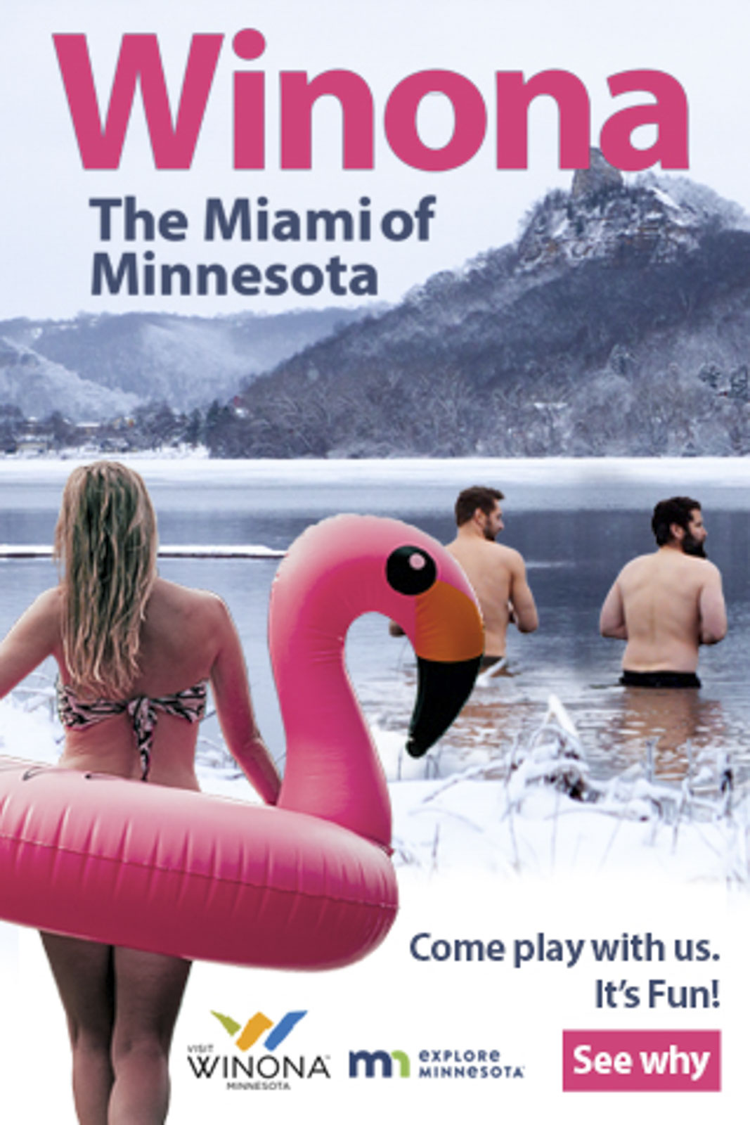
The Creative Execution
Our team built an imaginative, personality-forward platform designed to feel unmistakably “not like everyone else.” Key elements included:
- Tropical color palettes and warm-weather energy applied to winter and shoulder-season advertising
- Flamingo pool floats placed in humorous, hyper-Minnesotan contexts—snowbanks, frozen lakes, historic districts
- Playful, wink-filled copywriting that embraced the joke while still elevating Winona’s real assets
- A flexible identity system easily adaptable across print ads, digital campaigns, social media, and video
- Seasonal continuity enabling the brand to grow from a winter stunt into a long-term narrative platform
The campaign replaced safe, predictable visuals with personality, confidence, and charm. It didn’t ask permission—it made an entrance.

The Results
The Miami of Minnesota rebrand quickly proved its value:
- Record-setting lodging tax revenue in nearly every year following launch
- Millions of dollars in earned media exposure from national press and viral social engagement
- Significant growth among younger demographics, including Millennials and Gen Z
- Higher brand recall and differentiation scores in audience feedback
- Fast-paced organic sharing driven by the humor and novelty of the creative
- A brand platform that became a year-round identity, not just a seasonal campaign
- Recognition from industry peers for its originality, boldness, and creative risk-taking
Most importantly, it reframed how people talked about Winona—proving that when a destination embraces its quirks, leads with confidence, and dares to be memorable, audiences respond in kind.